Breaking the Rules: How to Use Color Contrasts for Impact
Color is one of the most powerful tools in any designer’s arsenal. It grabs attention, evokes emotion, and can even tell a story. But while traditional color theory might urge you to stick to harmonious palettes, where’s the fun in playing it safe? Sometimes, the best designs come from breaking the rules and embracing bold, unexpected contrasts.
Let’s dive into the rebellious world of color contrasts—how to use them, when to ignore the so-called “rules,” and how they can transform your designs from bland to breathtaking.

The Science of Color Contrasts
Before you can break the rules, you need to understand them. Color contrast isn’t just about making things “pop”; it’s rooted in science and psychology. The human brain is hardwired to notice differences, and contrasting colors create visual tension that immediately grabs attention.
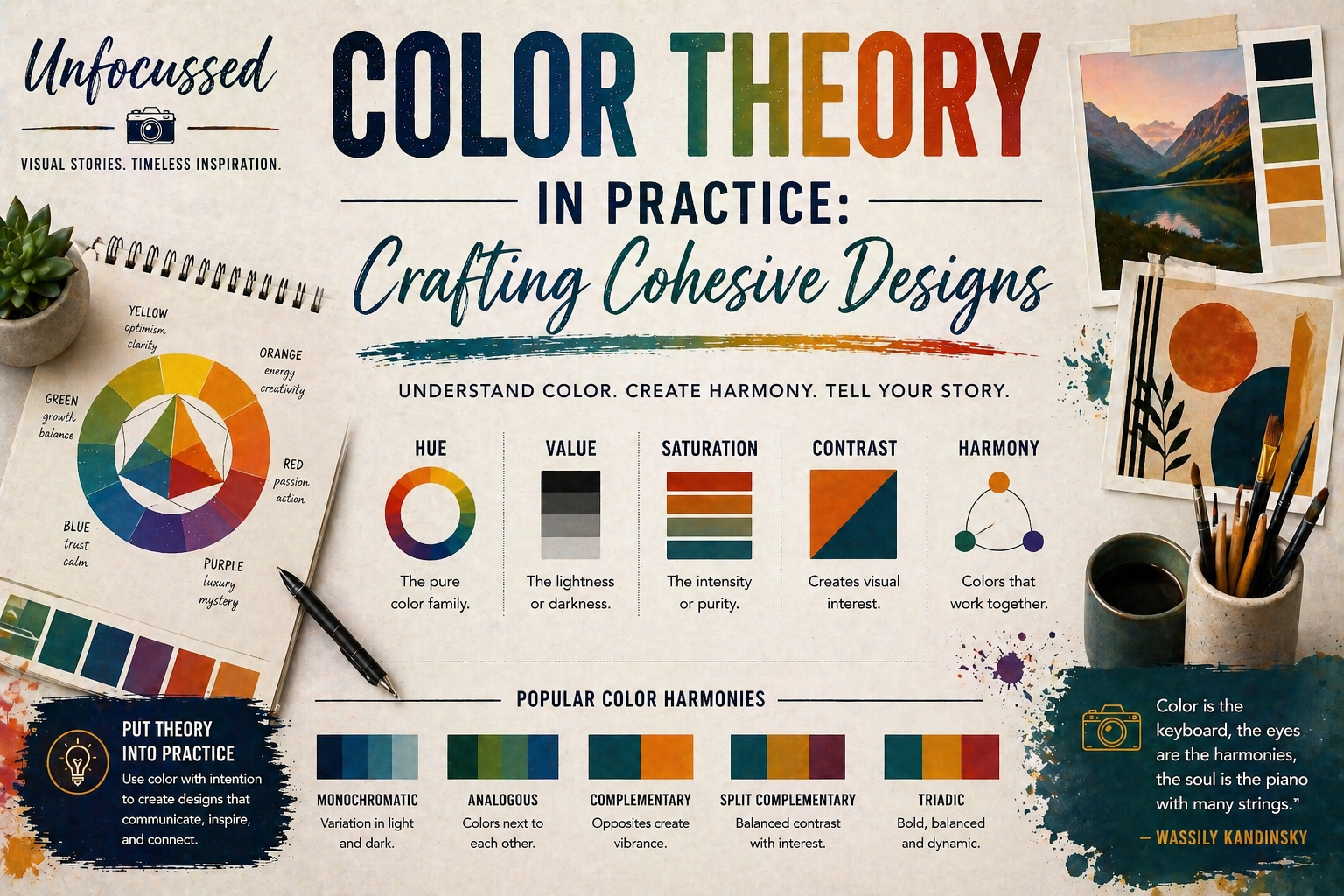
There are several types of color contrasts to consider:
- Hue Contrast: Colors on opposite ends of the color wheel (like blue and orange) create the most dramatic effect.
- Value Contrast: The difference between light and dark colors, such as black and white, can emphasize form and hierarchy.
- Saturation Contrast: Pairing vibrant, saturated colors with muted tones creates depth and balance.
Understanding these principles allows you to manipulate contrast to your advantage, whether you’re aiming for subtle sophistication or in-your-face impact.
When Rules Were Made to Be Broken
Traditional design advice tells us to aim for harmony: analogous colors, gentle gradients, and subtle tones. And sure, that works—if you want your design to blend into the background. But what about when you want your work to stand out?
Breaking the rules means embracing contrasts that shouldn’t work but do. Think electric pink paired with lime green, or deep purple against bright yellow. These combinations might sound jarring, but in the right context, they can feel fresh, energetic, and modern.
Here’s a key takeaway: when breaking the rules, purpose matters. A loud, clashing palette is perfect for a concert poster but might feel inappropriate in a healthcare brochure. Know your audience and your goals before you go full neon explosion.

Techniques for Using Bold Color Contrasts
Now that we’ve embraced our inner rule-breaker, let’s talk techniques. How do you actually make bold color contrasts work in your designs? Here are some tried-and-true methods:
- Pair Complementary Colors: Opposites on the color wheel (like red and green or blue and orange) are natural attention grabbers.
- Use Contrast for Hierarchy: Highlight key elements like call-to-action buttons or headlines by giving them high-contrast colors.
- Play with Patterns: Combine contrasting colors in geometric patterns or textures for a dynamic, eye-catching effect.
- Add Neutral Anchors: Ground your bold colors with neutral tones like white, black, or gray to avoid overwhelming your audience.
The key is balance. Let the contrasts shine without overwhelming the overall design. Bold doesn’t mean chaotic.

Color Contrast in Digital Design
In the digital world, color contrast isn’t just an aesthetic choice—it’s also a matter of functionality. High contrast improves readability, accessibility, and user experience. Ever tried reading yellow text on a white background? Yeah, don’t do that.
Here’s how to use contrast effectively in digital design:
- Focus on Accessibility: Ensure text and background colors meet WCAG contrast ratio guidelines to be legible for all users.
- Create Focal Points: Use contrasting colors to draw attention to buttons, links, or key elements on a webpage or app.
- Consider Screen Differences: Colors can appear differently across devices, so test your designs on multiple screens.
Digital design is where the marriage of function and flair comes to life. Nail your contrasts, and your designs will look good and work well.

Iconic Examples of Bold Color Contrasts
Don’t just take my word for it—look at the brands and artists who’ve mastered the art of contrast:
- Andy Warhol: His pop art prints juxtapose bold, clashing colors to create iconic, unforgettable imagery.
- Spotify: The brand’s bright green and black palette cuts through the noise and is instantly recognizable.
- Memphis Design Movement: This 1980s aesthetic pushed boundaries with clashing patterns and vibrant, contrasting colors.
These examples prove that bold choices can lead to timeless results—if you have the confidence to embrace them.
Final Thoughts
Using bold color contrasts isn’t about throwing the color wheel out the window—it’s about understanding it well enough to break the rules intelligently. Whether you’re designing a poster, branding a company, or creating digital content, don’t be afraid to take risks with color.
Because at the end of the day, safe designs might get a polite nod, but bold designs get remembered. Go ahead, break the rules, and let your colors clash. Just make sure it’s intentional—and fabulous.

What are your favorite bold color combinations? Let us know in the comments—or better yet, show us your most daring designs!
Turn Bold Ideas Into Stunning Designs with Professional Services
Bold color contrasts are more than eye-catching—they’re transformative. Whether you’re creating branding materials, digital interfaces, or standout promotional designs, having a professional touch ensures your ideas come to life with precision and impact. At Unfocussed Photography and Imaging, we specialize in crafting visuals that grab attention and leave lasting impressions.
- Custom Branding Solutions: Collaborate with our team to design logos, business cards, and marketing materials using bold, innovative color palettes.
- Web and Digital Design: Create dynamic digital interfaces with high-contrast elements optimized for usability and style.
- Creative Consultations: Work with our experts to refine your vision and choose the perfect color combinations for your project.
Let’s turn your boldest ideas into designs that command attention and resonate with your audience.
Explore our services today and bring your creative vision to life!