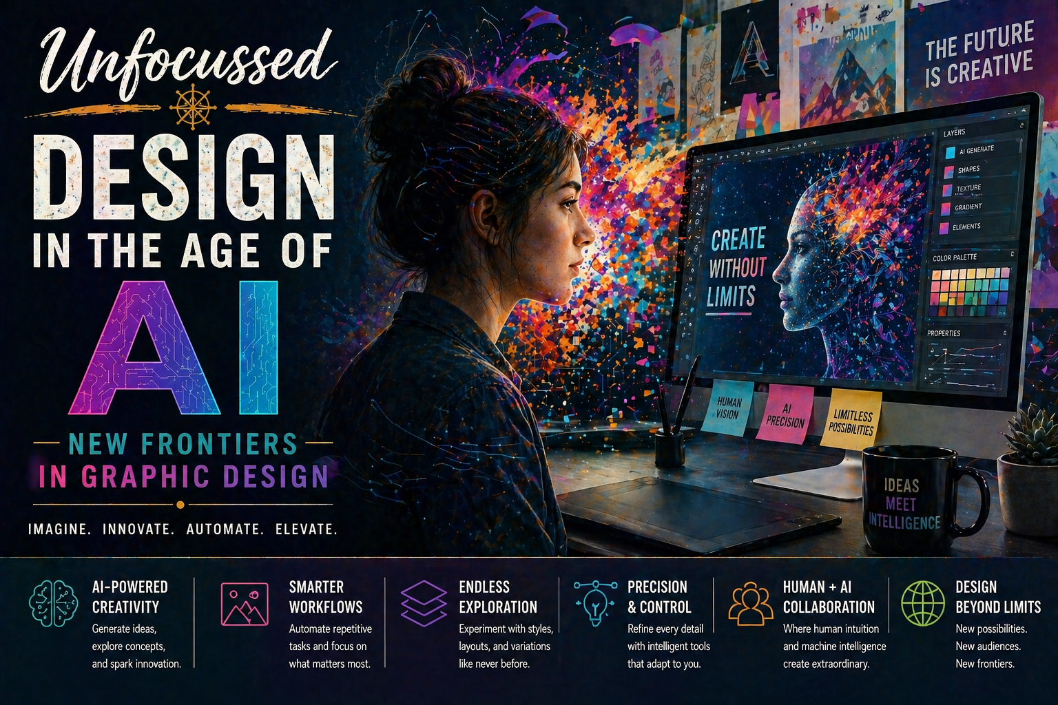
Dynamic Duo: The Relationship Between Typography and Storytelling
Storytelling is about more than just the words you choose—it’s about how those words are presented. Typography, the art and technique of arranging type, plays a powerful role in shaping the way your story is perceived. From the elegance of serif fonts in literary novels to the boldness of sans-serif fonts in sci-fi adventures, typography can evoke emotions, convey themes, and even become part of the narrative itself.
In this guide, we’ll explore how typography and storytelling intersect, offering practical tips and creative insights to help you make your text as dynamic and engaging as your words.
Why Typography Matters in Storytelling
Typography isn’t just about aesthetics—it’s a storytelling tool that can amplify your message. Here’s why it matters:
- Establishes Tone: A flowing script font sets a romantic tone, while a blocky typeface suggests grit or tension.
- Enhances Readability: Thoughtful typography ensures your story is easy and enjoyable to read, keeping your audience engaged.
- Creates Visual Identity: The fonts you choose can become a signature style for your book, brand, or project.
- Supports Themes: Typography can subtly echo the mood, setting, or era of your story, adding depth and cohesion.
From subtle cues to bold statements, the way your words look is just as important as what they say.
Step 1: Understand the Basics of Typography
Before diving into creative applications, it’s helpful to know some typography fundamentals. Here are the key elements:
- Font Styles: Fonts are often categorized as serif, sans-serif, script, or decorative. Each conveys a different tone.
- Kerning: The spacing between individual letters. Adjusting kerning can affect readability and aesthetics.
- Leading: The vertical space between lines of text. Proper leading ensures text feels open and comfortable to read.
- Hierarchy: Using different font sizes or weights to emphasize headings, subheadings, or key points.
These building blocks form the foundation of effective typography and storytelling synergy.
Step 2: Match Typography to Your Story’s Tone
The fonts you choose should reflect the tone of your story. Consider these examples:
- Romance: Elegant script fonts like Great Vibes or Playfair Display evoke softness and intimacy.
- Horror: Distressed or jagged fonts like Creepster or Cold Dead Hands convey unease and tension.
- Sci-Fi: Futuristic sans-serif fonts like Orbitron or Exo suggest innovation and technology.
- Historical Fiction: Classic serif fonts like Garamond or Baskerville echo timeless elegance and tradition.
By aligning typography with tone, you create a cohesive experience that draws readers into your narrative world.
Step 3: Use Typography to Build Atmosphere
Typography can enhance your story’s atmosphere through visual cues. For example:
- Handwritten Fonts: Use script or handwritten fonts to simulate diary entries or personal letters within the story.
- Period-Appropriate Fonts: Match fonts to your story’s era, like Art Deco styles for 1920s settings or Gothic fonts for medieval tales.
- Abstract Layouts: Experiment with creative text arrangements to mimic a chaotic or dreamlike environment.
These techniques can make your story’s presentation feel more immersive and intentional.
Step 4: Establish a Typographic Hierarchy
Readers rely on visual cues to navigate text. Creating a clear typographic hierarchy ensures your story flows smoothly:
- Headings: Use larger, bolder fonts to mark chapters or sections.
- Subheadings: Employ slightly smaller or italicized text to break up content without overwhelming the reader.
- Body Text: Choose a clean, legible font for the main text, prioritizing readability over flair.
- Emphasis: Highlight key phrases with bold, italics, or color to draw attention without overusing effects.
Consistent hierarchy helps readers navigate your story intuitively, enhancing their overall experience.
Step 5: Incorporate Typography as a Narrative Element
Typography doesn’t just support storytelling—it can become part of the story itself. For example:
- Visual Emphasis: Use bold, oversized text to convey a character shouting or emphasizing a critical moment.
- Text Shapes: Arrange text in shapes, like spirals or waves, to mimic movement or abstract concepts.
- Font Changes: Switch fonts to represent different voices, perspectives, or time periods within the story.
These creative approaches can add visual intrigue and deepen reader engagement.
Step 6: Balance Creativity with Readability
While typography offers endless creative possibilities, readability should always come first. Here’s how to strike the right balance:
- Avoid Overcrowding: Leave plenty of white space to make your text feel open and inviting.
- Stick to Two or Three Fonts: Too many fonts can overwhelm readers; focus on a cohesive palette.
- Test Readability: Ensure your typography works well in different formats, from print to digital screens.
Balancing creativity with functionality ensures your typography enhances, rather than detracts from, your storytelling.
Step 7: Create a Visual Brand for Your Story
Typography can extend beyond your story’s pages, becoming part of your branding. For example:
- Book Covers: Use distinctive fonts to create eye-catching designs that reflect your story’s essence.
- Social Media Graphics: Apply your typography choices consistently across posts, teasers, and promotions.
- Merchandise: Incorporate your story’s fonts into themed products like posters, bookmarks, or apparel.
Establishing a typographic identity makes your story instantly recognizable and memorable.
Final Thoughts
The relationship between typography and storytelling is a dynamic one, offering endless opportunities to enhance your narrative with thoughtful design. From setting the tone to shaping the reading experience, typography is a tool every writer should consider.

So go ahead—experiment with fonts, layouts, and creative designs to make your words truly unforgettable. Your story deserves to look as good as it sounds.
Transform Your Typography Dreams into Stunning Designs
Typography is more than just letters—it’s art, emotion, and storytelling. Whether you’re creating an ornate monogram, experimenting with stylized lettering, or crafting a unique typographic identity for your project, we can help bring your vision to life. At Unfocussed Photography and Imaging, we specialize in typography design tailored to your creative needs.
- Custom Letter Designs: Collaborate with our experts to design intricate letters, monograms, or logos that align with your vision.
- Typography Consultation: Receive professional guidance on selecting and blending fonts for your brand, book, or project.
- Digital and Print Applications: Use your custom typography in book covers, marketing materials, or personal projects.
Don’t let your typographic ideas remain dreams—turn them into reality with professional design services that capture your style and creativity.
Explore our services today and bring your letters to life!