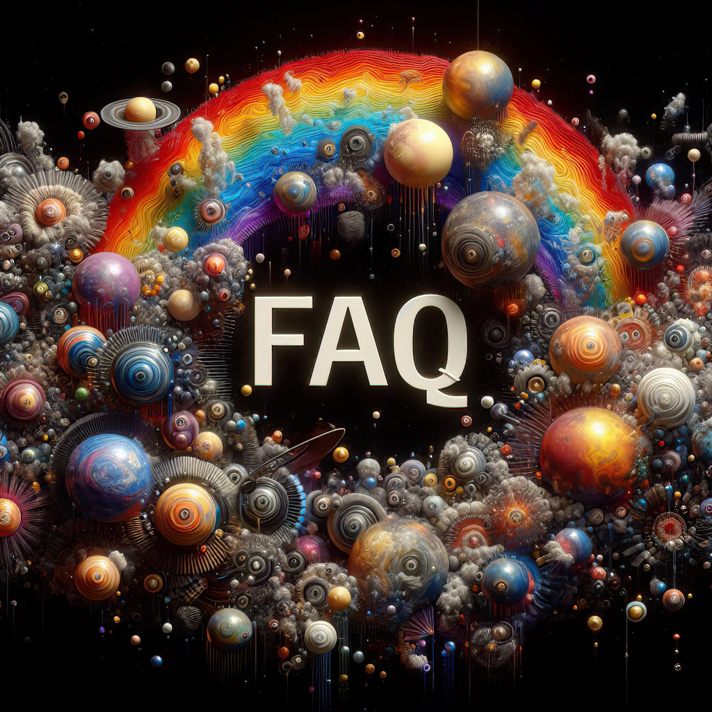
by Bill Tiepelman
The Evolution of Artistic Expression: Embracing AI in the Artistic Process
In the constantly evolving landscape of technology and art, the integration of artificial intelligence (AI) into creative processes has ignited a spectrum of opinions, debates, and, unfortunately, misconceptions. As an artist who has navigated the tides of technological change from digital photography to AI-powered tools, I've witnessed firsthand the resistance to new mediums and the eventual acceptance that follows. In this post, I aim to address the criticisms surrounding AI, particularly in art and image generation, dispel some common myths, and share my personal journey through technological evolution in art. Debunking the Myth: AI Tools and Artistic 'Theft' A prevalent misconception is that AI tools used in image generation commit some form of 'theft' from real artists. This assertion stems from a misunderstanding of how AI works and what it represents. Ethical AI in art, much like in other fields, operates under guidelines that respect creativity and copyright, ensuring that the technology aids artists rather than detracts from their originality.AI in image generation does not 'steal' but rather 'learns' from vast datasets, which are often publicly available or contributed with consent. These tools analyze patterns, styles, and techniques, enabling them to assist artists in creating new, unique pieces. It's a collaborative process between human and machine, enhancing creativity rather than replacing it. Personal Journey: Embracing Technology in Art From Digital Photography to Photoshop Over two decades ago, when I transitioned from traditional to digital photography, I faced significant skepticism. Critics deemed my work as "not real photography" because I used a digital camera. This sentiment deepened when I began employing Photoshop for post-processing, with many dismissing these images as "not real photos." Yet, today, digital photography and image editing have become industry standards, indispensable in the toolkit of any serious photographer. The Leap into Development and WYSIWYG Tools My journey didn't stop at photography. When I ventured into development work, I utilized WYSIWYG (What You See Is What You Get) tools, which were frowned upon at the time. Critics labeled me as "not a real coder," arguing that true coding required manual, line-by-line programming. However, as technology advanced, these tools gained recognition for their efficiency and ability to democratize coding, becoming essential in the tech industry. The Inevitability of AI Integration in Digital Art and Photography As we continue to navigate the ever-expanding universe of digital art and photography, it becomes increasingly clear that the integration of AI tools is not just a trend but an inevitability. The rapid pace at which these tools are being adopted and developed means that, soon, it will be a challenge to find digital art or photography processes that don't employ AI in some capacity. This shift isn't merely about the proliferation of tools that have "AI" in their names but reflects a deeper transformation in how art is created, processed, and even conceptualized. AI algorithms are becoming embedded in everything from basic photo editing software to complex graphic design suites and 3D modeling programs. They assist in color correction, pattern recognition, and even in suggesting creative directions, thereby streamlining workflows and enhancing creative outputs. The fact that many modern digital tools and platforms are incorporating AI functionalities underscores this transition. Whether it's for enhancing the resolution of images, automating tedious editing tasks, or generating entirely new elements within a composition, AI's footprint in the creative domain is expanding rapidly. This isn't about replacing the artist but about augmenting and elevating their capabilities. Moreover, the democratization of AI tools means that they are becoming more accessible to artists at all levels, from amateurs to seasoned professionals. This accessibility is fostering a new era of creativity, where the barriers to entry are lowered, and the possibilities for innovation are vast. In this context, resisting AI's integration into digital art and photography might not only limit an artist's toolkit but could also isolate them from the evolving language of creativity. Embracing AI doesn't mean abandoning the core principles of art but rather expanding them into new dimensions and exploring uncharted territories of expression. As artists, embracing the inevitable integration of AI into our tools and processes allows us to stay at the forefront of innovation, ensuring that our work remains relevant and vibrant in a rapidly changing digital landscape. Let's look forward to a future where AI and human creativity coexist in harmony, each pushing the boundaries of what's possible in art and beyond. The Misinformation Surrounding AI in Art Many criticisms of AI in art come from a place of misinformation or a lack of understanding. Critics often argue that artists using AI are "stealing from real artists," not realizing that those employing these tools are themselves genuine creators seeking to expand their artistic horizons. AI assists in expediting the creative process, inspiring new ideas, and enhancing the final artistic product.Just as digital cameras and Photoshop were once misunderstood and criticized, AI tools face similar scrutiny. However, just like their predecessors, they offer new opportunities for expression and innovation. Embracing Change and Continuing the Dialogue The resistance to new technologies in art is not a new phenomenon. It's a cycle that repeats with each technological advancement. As artists and creators, it's crucial to remain open to new tools and mediums, understanding that they do not replace our creativity but rather extend our capabilities.By educating ourselves and others about the ethical use of AI in art, we can dispel myths and embrace these tools as valuable additions to our artistic practice. Let's continue the dialogue, keeping an open mind and a creative spirit, as we explore the vast potential of AI in enhancing and transforming artistic expression. In sharing this journey and reflection, I hope to contribute to a more informed and open-minded conversation about the role of AI in art and beyond. The evolution of artistic tools, from the brush to the digital pen to AI algorithms, reflects our ongoing quest for new methods of expression. Let's embrace this journey together, with curiosity and respect for the endless possibilities it presents.


